Designing Shopify Product Pages for Conversions
Feb 4, 2026

Have you ever looked at your Shopify website and thought, this should be converting better than it is… right?
And I'm sure you’ve put a lot of effort into your website, design, branding, product photography. From the outside, everything about your ecommerce website looks like it should be doing its job.
Yet, sales feel slower than expected.
This is something I see all the time when I review Shopify store design. Nothing is “wrong” in the obvious sense, but somewhere in the buying experience, people start to hesitate.
People look around your website, maybe even add products to their carts. (You are following them on your Shopify app, don't you?) But then they just leave without buying.
If that sounds familiar, you’re not doing anything wrong, and you are definetely not alone. And no it doesn’t mean you need to burn your Shopify site down and start over or chase a totally new e-commerce aesthetic.
More often than not, there is a product page conversion problem. And in this blog post I will show you several common mistakes you can avoid when designing a product page.
First Things First: Website Traffic Usually Isn't the Real Issue
When a Shopify site isn’t converting, the instinct is almost always the same:
We need more traffic.
More ads. More content. More website design inspiration pulled from other Shopify stores that look successful.
But here’s the uncomfortable part. If your product page isn’t converting now, sending more people to it usually just makes the problem even bigger. And at this point you've already spent an enormous amount of time and money.
Most likely traffic is not a problem at all if you pay attention to your marketing. But if your website visitors don't know what to do on your websitem they will never turn into customers. And you end up spending all this ad money for nothing.
This is where conversion rate optimization actually matters.
You can have a beautiful shopping website and still lose sales if the product page is not optimized for sales.
So let's fix this.
The First Five Seconds Matter More Than You Think
When someone lands on your Shopify product page they have a lot of questions and hesitation.
That’s why the first screen of your product page can’t just explain what the product is. It has to grab attention immediately and make leaving feel like a mistake.
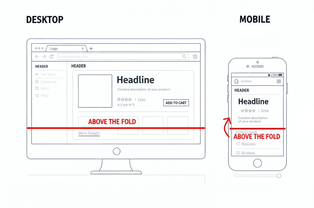
Above the fold should do three things at once:
It should feel relevant.
It should spark interest.
And it should create a sense of “this might actually solve my problem.”
If the top of your page is just a nice image and a vague headline, nothing is pulling the customer in.
Sometimes customers leave because they’re confused. Other times, they leave because nothing on your product page hooked them.
A strong above-the-fold layout makes it obvious:
what the product does
why it exists
and why it’s better than the alternatives
But more importantly, it frames your product as a solution to their problems. The page reminds the customer of the frustration they already have and positions your product as the answer.
The goal of above the fold is to people them think: “Okay. This is for me. I need to see the rest.”
Now, here’s how to actually do that.
Above-the-fold checklist you can apply right now
Open one of your Shopify product pages and look only at the first screen, don't scroll further.
Ask yourself:
1. Is the core benefit obvious in one sentence?
Not what the product is, but what it does for the customer.
If your headline sounds poetic, clever, or brand-y but doesn’t explain the outcome, it’s not doing its job.
2. Can someone tell who this product is for immediately?
If the page could apply to “anyone,” it usually connects with no one. Your positioning should be very specific and relevant to the customer.
3. Is the product shown in context, not just isolated?
A floating product on a white background looks nice but it doesn’t answer “how does this fit into my life?”
Context reduces hesitation. Add several images of the product being used in real life.
4. Is the price visible without effort?
Hiding the price above the fold creates friction.
Even if someone doesn’t love the number, they also would not be thrilled if the have to look for the price all over your website.
5. Is the primary action impossible to miss?
One clear CTA.
Not three competing buttons. And also not buried below the fold.
6. Are you including trust ques?
Right near the product name include user ratings from Trustpilot, or at least from your website reviews. Include the real number and show how many buyers actually bought and reviewed this product.
People feel more confident buying when they see that others had already done so.
If any of these answers are “no,” that’s a conversion leak. And you can go fix it right after you finish reading.
If you want to turn your Shopify website into a high-converting sales machine, book a free call with me below.

Product Photography Should Remove Uncertainty
Product photography exists for one main reason:
to remove uncertainty when a customer lands on your product page. You can argue with me on that one, but it is not there for aesthetics. Although a beautiful product photo can go a long way, but only if it's providing the information the customer is looking for.
When someone opens a Shopify product page, they’re not looking to admire your photos. They’re trying to understand what they’re buying and whether it’s the right choice for them.
This is where many product pages fall short.
On many product pages, the images are technically well done. They’re clean, consistent, and aligned with the brand. What they often don’t do is help the customer make a decision.
Looking at a single product image on a neutral background doesn’t explain how the product is used, how it fits into daily life, or how it compares to what the customer already has in mind.
Good product photography takes some of that guesswork away from the customer.
It shows the product in context.
It makes scale and details obvious.
It communicates what changes after the product is used.
Better yet if it shows all the benefits of your product for the customer. You can even include infographics.
That’s why multiple images matter. Not for visual variety, but because they reduce the amount of interpretation required.
Comparison photos, close-ups, and in-use shots help the customer move closer to a decision without relying on copy. The more clearly the photos communicate the outcome, the less effort the customer has to put into imagining it.
When product photography does its job, buying feels straightforward.
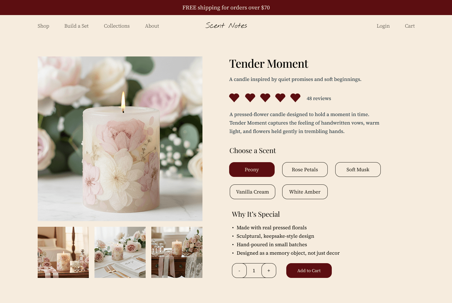
Here is an example of product page, showing the product in the different set ups.
Social Proof Belongs Near the Decision
As I already mentioned before, when we talked about the above-the-fold section, social proof is very important.
When someone lands on a product page, they already assume other people have been here before them.
They want to know what happened.
Social proof plays a role early in the decision process. Customers look for signs that this product has been chosen, used, and found great by others.
On Shopify product pages that convert well, social proof appears close to the top of the page. Star ratings, review counts, or short credibility cues are visible without scrolling.
This gives customers a sense of context before they invest more attention.
Put the longer reviews later on your page layout. Once someone is interested, they start looking for details that help them picture their own experience. Reviews that mention real situations, use cases, or outcomes tend to answer those questions more clearly.
Photos attached to reviews help bridge the gap between browsing and buying. Seeing the product in someone else’s hands, home, or routine makes the experience feel more concrete.
All this helps customers picture themselves using your product.
Product Descriptions Should Answer Real Questions
If customer started reading your product description, congrats! This means that they are already kinda interested.
This is the moment where many Shopify product pages either overwhelm the customer or say almost nothing at all. Long blocks of text get skipped. Short, vague descriptions leave too many gaps.
A product description should help the customer understand what they’re buying without making them work for it.
That means explaining what the product does, how it’s used, and what changes once they have it. Not in a story or a marketing language. In a way that feels practical and grounded.
Customers read product descriptions to answer specific questions.
They want to know how the product fits into their situation, whether it solves the problem they have, and what to expect after purchasing. If those answers aren’t there, hesitation creeps in.
Try to remember what question about the product pop up in your inbox the most, and include the answers in the product description, if it makes sense.
When a description does its job, the customer doesn’t need to scroll back up to re-check what the product is or why it matters.
A well-written product description supports the decision that’s already forming. And make clicking "Add to Cart" that much easier.
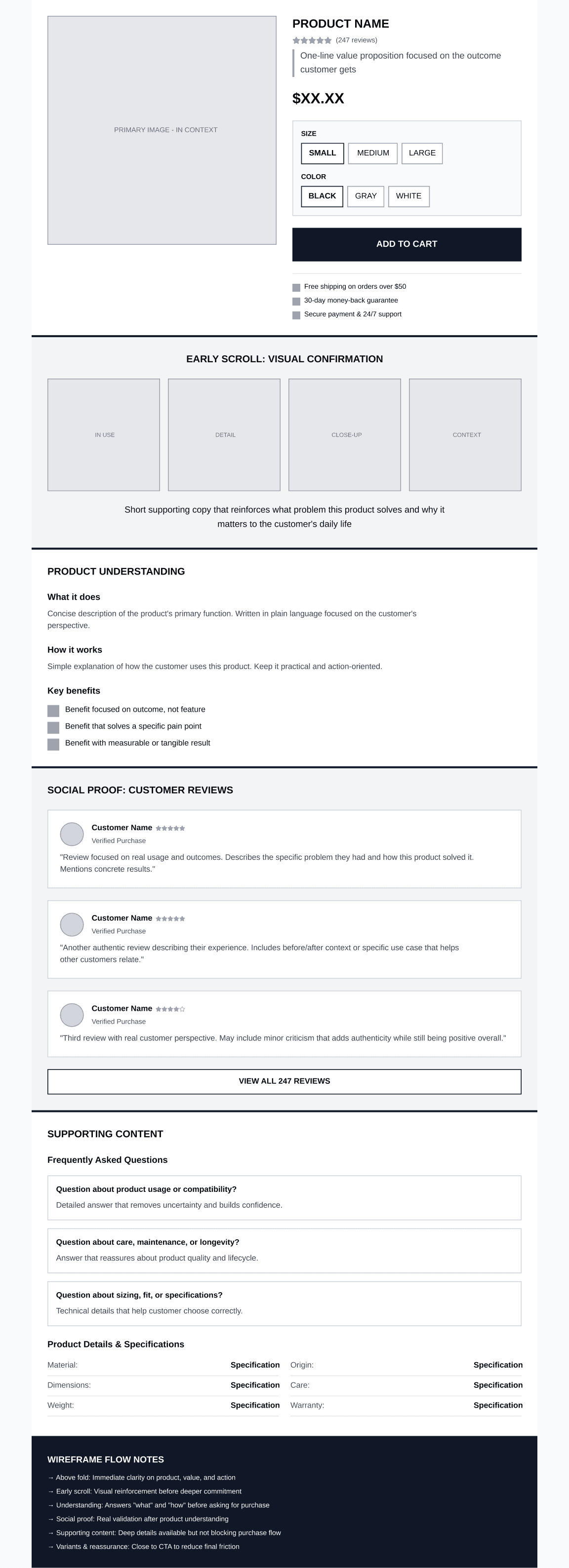
Page Length and Scroll Fatigue
Product pages lose conversions because of how that content is experienced while scrolling.
Let me explain, what I mean by that.
Customers move down a product page with a goal. They are looking for information that will help them make a decision. When the pacing feels off, attention fades even if the content itself is good.
This often happens when important information appears too late, or when the page keeps repeating ideas the customer has already understood. The scroll continues, but it doesn't help the desicion-meking process.
On pages that convert well, scrolling feels purposeful. Each section adds something new to the picture. And nothing feels like a filler, that is there because you just needed to put something on the page.
A well-structured product page usually introduces information in the same order a customer thinks.
Early on, the page focuses on understanding the product and why it exists.
A bit further down, it starts answering practical questions about use, fit, or outcome.
Only after that does it slow down and offer reassurance through reviews, details, or additional context.
When this order is reversed, problems start to show up.
If long descriptions appear before the customer understands the value, they get skipped. If reviews come before the product is clear, they don’t carry much weight. If shipping or return details appear far below the buying moment, customers scroll back up or leave the page to look for answers elsewhere.
Here is a rough wireframe that can help you understand the page flow.
A Final Note on Product Pages
When you look closely at how people move through a product page, it becomes clear that conversion is less about persuasion and more about support. Customers arrive with interest, but they also arrive with questions. As they scroll, they are checking whether the page keeps pace with what they need to know next.
When information appears in a way that matches that process, the page feels easier to move through. The customer understands what they are looking at, why it matters, and how it fits into their situation. The decision develops gradually, without friction drawing attention to itself.
Many product pages already contain everything a customer needs to buy. The issue is often just the order, placement, and emphasis of what is already there.
This is why small structural changes tend to have a noticeable impact.