6 Common Shopify Mistakes That Cost You Sales
Feb 11, 2026

There is a very specific kind of frustration that comes with running a Shopify store that is doing “okay”.
You are not failing, and the store is making money. But you are stuck in that awkward middle zone where the effort you put in does not quite match the results you get back. You tweak pages, move sections around, read Shopify hacks, save Shopify tips and tricks posts for later, maybe even try a few Shopify store building advice you found in a thread or a newsletter.
Orders come in, but not in a way that feels predictable. Some days are fine. Other days are strangely quiet. And when that happens, it is hard to point at one thing and say, “this is the problem”.
Everything technically works: payments go through and shipping is set up. Customers reach the checkout and then, sometimes, they just disappear, without you even knowing why. Just fewer Shopify orders than you expected.
So you do what most people do. You look outside the website for answers. You think about more marketing, better ads, another round of Shopify shipping tips to reduce friction, or an app that promises to help you increase sales on your Shopify website.
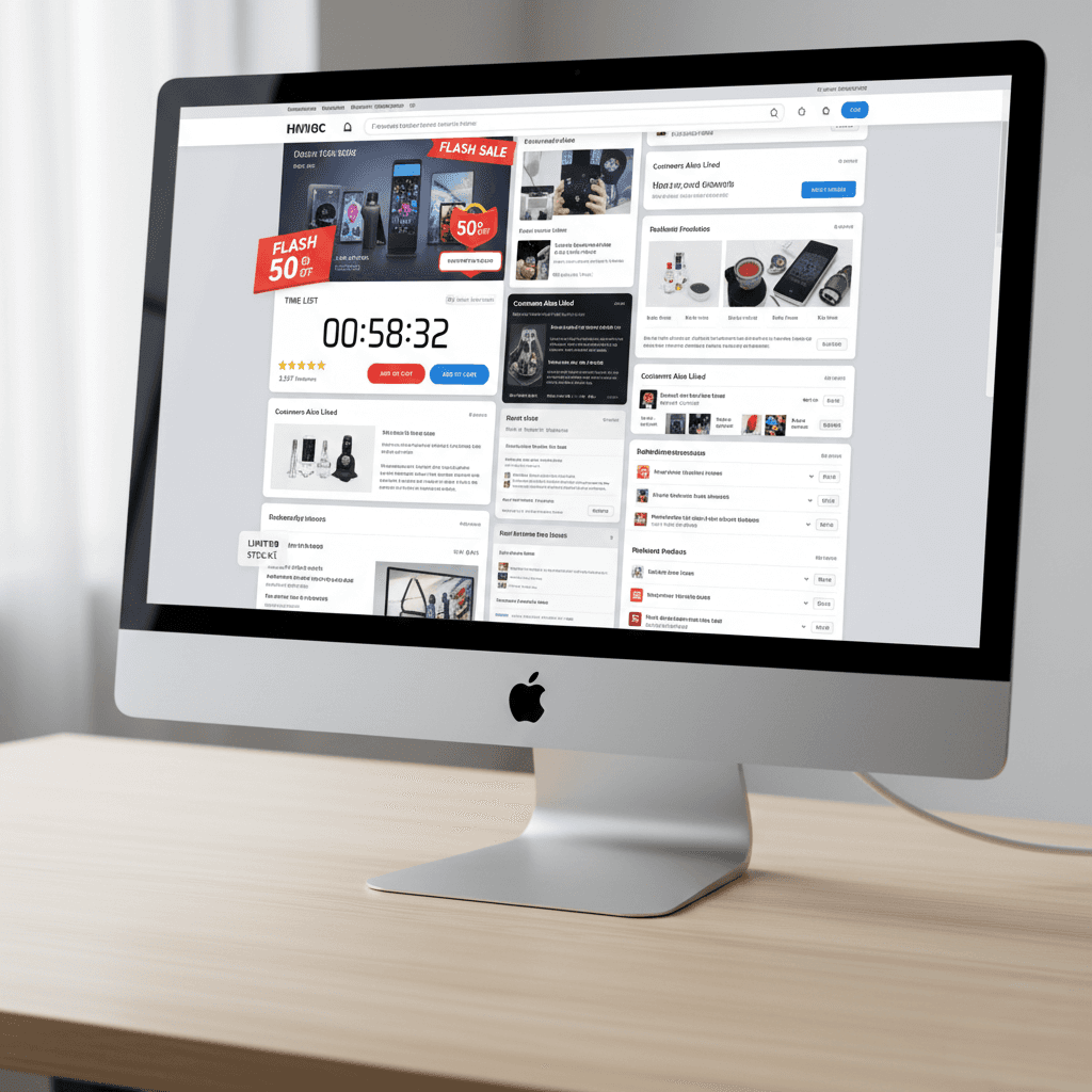
Bit by bit, the store gets heavier. More features, more banners, more logic layered on top of logic. From the outside it still looks professional, but using it starts to feel like work. There is more to read, more to consider, more moments where a customer has to stop and think instead of just moving forward.
This is where many ecommerce businesses end up without really noticing. Nothing is broken enough to fix urgently, but the buying experience is no longer as smooth as it could be.
This article is about those moments. The small, easy-to-miss things that slow people down or make them hesitate, even when they already want the product. If your Shopify store feels like it should be selling more than it does, this is usually where the answer starts.
Mistake #1: Treating “Add to Cart” as a Win
A lot of store owners relax a little too early when someone adds a product to the cart.
It feels like progress. The product page worked. Interest was there. Something clearly clicked. And yes, getting someone to add to cart is a good sign. But it is not a commitment. It is closer to “I might buy this” than “I’m buying this right now”.
This is where many Shopify stores lose momentum.
After add to cart, customers often slow down instead of speeding up. They start scanning again. They look for reassurance. They check prices one more time, think about shipping, delivery timing, returns, or whether this is really the best option. If the store treats this moment like the job is already done, it leaves those questions unanswered.
If your Shopify store treats this moment as a formality instead of a decision point, you are likely losing sales from people who were already very close to buying.
Here’s what to do instead.
Open your cart page and look at it like someone who already wants the product but is double-checking their decision. Ask yourself what could slow you down right here. That is usually the first thing to fix.
Start with the next step. There should be one clear primary action on the cart page. Make “Continue to checkout” obvious and visually dominant. Everything else should fade into the background.
Then deal with the usual doubts. Show shipping and delivery timing directly on the cart page, without making people click around. If there is free shipping or a clear delivery window, say it near the total.
Do the same with returns. If returns are simple, say it in one short line. Do not hide it in a policy page. This alone removes a surprising amount of hesitation.
Check how the product looks in the cart. The image should be clear, the product name understandable, and key details like size or color easy to confirm. People hesitate when they are not fully sure what they are about to buy.
Next, remove distractions. Turn off popups on the cart page. Be careful with cross-sells and banners. This is not the moment to add choices.
Finally, check the cart on your phone. If it feels cramped, confusing, or slow on mobile, it will cost you sales.
A good cart does not try to convince people. It simply makes finishing the purchase feel easy.
Mistake #2: Making People Think Too Hard
Most Shopify stores don’t lose sales because customers dislike the product. They lose sales because buying starts to feel like work.
This usually shows up when a page asks people to process too much at once. Too many sections, too much text, too many things competing for attention. Instead of being guided through a decision, the customer is left to figure out what matters, what to read first, and what to ignore.
From the store owner’s side, this almost always comes from good intentions. You want to explain things properly. You want to answer questions upfront. You want the page to feel complete. The problem is that completeness often turns into overload.
This is what overcomplicated website layout looks like.
Customers are confused and try to figure out what is going on on your website. They scroll back and forth. They reread parts of the page and open another tab to compare or to “think about it”. They do so because the page does not help them move forward.
This is especially common on product pages. Long descriptions without clear structure. Important details buried halfway down. Multiple calls to action scattered across the page. Variant options that are technically correct but visually overwhelming.
Buying should feel guided, not demanding.
If someone has to invest effort just to understand what to do next, many of them simply won’t. And when buying feels like work, walking away feels like relief.
Mistake #3: Assuming People Trust You by Default
I’m sure you have heard a thousand times about building trust with your customers and I am even more sure that you are tired from hearing it. But please bear with me.
Because this is usually not about adding more trust badges or sprinkling testimonials everywhere. It’s about the small, boring questions people ask themselves while they’re browsing your store.
Things like: Will this actually arrive? How long will it take? What happens if it doesn’t fit? Who do I contact if something goes wrong?
You already know the answers to all of this. Your customers don’t.
And most Shopify stores make people work a bit too hard to find those answers. The information exists, but it’s tucked away in footers, hidden behind links, or written in a way that feels more legal than helpful. So instead of feeling reassured, people hesitate.
This shows up at very specific moments. When someone is deciding whether to add to cart. When they open the cart and look at the total. When they are one click away from checkout and suddenly start second-guessing the whole thing.
How to fix it?
Start with consistency. Open three random pages in your store. Product page, About page, FAQ, whatever. Do they feel like they belong to the same business? If one page sounds polished and another sounds unsure or generic, people notice. It creates a small “wait, what?” moment.
Next, look at how you talk to customers. Not what you say, but how you say it. Are there places where the copy suddenly sounds corporate, defensive, or overly formal? Things like policies, error messages, or checkout copy often slip into a completely different voice. That shift alone can make a store feel less human.
Then check your social proof, but be honest about it. A few real reviews placed where people hesitate are better than a wall of testimonials nobody reads. If reviews are hard to find or look copy-pasted, they do more harm than good.
Another easy one: remove anything that looks unfinished or forgotten. Empty sections, outdated announcements, broken links, placeholder text. Even one of these makes people wonder what else might be sloppy behind the scenes.
Mistake #4: Making the Next Step Hard to Spot
Here’s a quick test. Open your store and scroll through it without clicking anything. At every point, ask yourself: if I wanted to buy this right now, where would I click?
If you ever have to think about it, that’s the problem.
Go page by page and do this on purpose. On product pages, there should be one button that clearly means “this is how you buy”. Make it visually louder than everything else. Bigger, stronger contrast, no clever wording. “Add to cart” should look like the obvious move, not one option among many.
Then check your cart page. The checkout button should dominate the page. If there are links, banners, or secondary actions competing with it, mute them. Grey them out. Move them lower. This is not the place for exploration.
Next, look at your button labels. Replace anything vague. “Continue”, “Next”, “Learn more” are fine in some contexts, but not in buying flows. Be specific. “Continue to checkout” beats “Continue” every time.
After that, watch for sideways exits. Header menus, footer links, blog links, promo banners. If they are pulling attention away at decision points, remove them or reduce their visual weight. Forward motion matters more than completeness here.
Finally, do this entire check on your phone. If the main action is not visible without scrolling, fix that first. Mobile users will not hunt for it.
The goal is simple: at every step, there should be one obvious thing to do next.

Mistake #5: Trying to Fix Sales with Apps Instead of Structure
Let me guess. Sales dip, and your first move is the Shopify App Store.
That makes sense. It feels like doing something. One app for urgency, one for bundles, one for upsells, one for reviews, one for free shipping bars. None of them feel wrong on their own.
But stack a few of those together and suddenly your store feels like it’s shouting at people from every direction.
Here’s the blunt truth: apps don’t fix messy structure. They just sit on top of it.
If your product page is unclear, an urgency timer won’t magically make it clearer. If your cart already feels busy, adding an upsell popup just gives people one more reason to pause. Most of the time, apps are used to avoid fixing the boring stuff, like hierarchy, flow, and clarity.
So here’s what I’d actually do.
Stop installing anything new for a moment. Open your store and go through the path like a customer: product page, cart, checkout. Where does it feel awkward? Where do you have to think? Fix that first.
Then audit your existing apps. One by one. Ask yourself: what problem is this solving right now? If the answer is vague or theoretical, remove it. You’ll be shocked how often the store feels better immediately.
Apps should not compensate for a broken website flow. If the structure works, you’ll need fewer tools than you think.
Mistake #6: Staring at Numbers Instead of Watching What People Do
I bet you know their stats by heart. Conversion rate, traffic, Shopify orders, AOV. You can probably quote yesterday’s numbers without opening the dashboard.
And yet, those numbers rarely tell you why people are leaving.
Numbers tell you that something is wrong. They don’t tell you what is wrong.

If you actually want answers, you need to watch people use your site.
Set up session recordings or heatmaps and watch a few real visits. Not hundreds. Five or ten is enough. But real ones, not just people who window shop. Look for moments where people stop, scroll back up, hover, or bounce between sections. Those moments are gold. That’s where buying starts to feel uncertain.
Pay attention to what happens right before someone leaves. Not in theory, but on screen. Did they reread shipping info? Did they hesitate on variants? Did they get stuck deciding what to click?
And yes, use your own store like a normal customer once in a while. Slowly. Without skipping steps. Every time you think “huh, that’s a bit unclear”, assume customers feel it ten times stronger.
Conversion rate is the outcome. Behavior is the cause.
If you only look at dashboards, you end up guessing. If you watch real behavior, the problems stop being abstract and start being obvious.
Final thought
If there’s one thing I hope you take away from all of this, it’s that most Shopify stores don’t need more ideas but actually fewer obstacles.
Sales usually don’t disappear because people changed their minds about your product. They disappear because something along the way felt harder than it should. A pause. A question. A moment where buying stopped feeling obvious.
You know how everything works in your business. You know the rules, the shipping, the logic behind each decision. Your customers don’t. They only experience what’s in front of them, one step at a time.
You don’t need to rebuild your entire store or chase every new Shopify tip that shows up in your feed. Start smaller. Pick one place where people hesitate and clean it up. Make one step clearer. Remove one unnecessary distraction. Fix one moment that feels heavier than it should.
Do that consistently, and sales usually follow.
The frustrating part is that these small steps are easy to miss when you’re inside the business. That’s why sometimes it is better to get help from a professional. Book a call with me and I will make sure that your Shopify store is driving in sales like it should.